Saturday, January 1, 2011

Happy New Year 2011

Well, it’s a brand new year and this is my attempt to follow through and be more resolute in my blogging on the creation of the Silly Supermarket Series.  Last I left it, I had planned to talk about a big story in the news.  Seems there was a controversy surrounding the California raisin girl and a new makeover.  This drew the ire of many as can be referenced here:

http://finance.yahoo.com/family-home/article/108296/sun-maid-girl-makeover-sparks-controversy.html?mod=family-love_money

Now when I saw the controversy it jogged my memory back to a Silly Supermarket test concept.  As you may or may not know, Series 1 & 2 of the Silly Supermarket Stickers were created by Artist Rick Rose.  Top Shelf Enterprises purchased all of the sticker designs, copyrights, etc from the artist.  Now, when it came time to create a brand new series using a new team of artists, we needed to see if we could actually pull it off.  We made a contact with Artist “Canada” to see what he could do.  The design was never intended to be released in a series but purely a test to see what he could do.  Perhaps we were “out in front” on this since the concept was created in 2004.  Anyway, Steve worked with Canada from an initial sketch design.  Canada attempted to put the concept into color but did not have any of the computer art programs to give the design the color and depth that it needed.  This was actually a blessing in disguise. Canada found another artist, Workhorse, on an artist for hire forum.  It truly was the most important contact made in the creation of the series.  With the first two pillars in place, Canada (for pencil roughs) and Workhorse (for color), the series was on it’s way.  Steve and I used to often talk of “having and easter egg” anytime a new revision was in our email Inbox.  It was truly exciting (and just a lot of fun).  Anyway, I share the rendition of Fun-Maid in the light of what was a controversy just a year ago.  Artist Workhorse tried something a little different with the background and that (in hindsight) was also ahead of its time.  Enjoy.

funmaid

Tuesday, December 22, 2009

Blasted Flakes

BLASTED FLAKES PARODY

The Blasted Flakes parody title was hatched in my mind one day. It could have been while drifting off to sleep or while driving into the office (not sure which) but when a title comes to you it must be written down. Many a night I had thought up a good title thinking to myself "I will remember it in the morning" only to have it drift away as a distant memory. The "They're G-r-r-enades" was the perfect fit that makes this gag really pop. There were many iterations to this design and I share some of them here for the very first time. This parody design was moved along through the development process by TSE's VP Steven Benisch. During the production phase, we talked about the concepts on a daily basis and Steve and I always liked having an Easter Egg in our email inbox. That meant that overnight there was a design that was worked on and ready for review in the morning. Steve always noted that the designs are "like your children" as you bring them to life. When we got the first renditions for the tiger, I wasn't all that enthused by the telescope eyes.

Looking at it again it has kind of grown on me. The first tiger rendition had a much fatter face and a lot more teeth than I thought should be in Tony's mouth. Some of the major changes as you can see were to the tigers overall look. In retrospect I really like the drawing but I am just as pleased with the final version we were able to come up with.

One artist codenamed "Canada" was responsible for the sketch. His forte is in cartooning so pencil is his medium. Canada hooked us up with a second artist who could bring the concepts to life (in color). The second artist is codenamed "Workhorse". Workhorse is probably responsible for 80% of the color work done on the Silly Supermarket National release. He worked long hours into the night with TSE's art director (Steve). As you can see there were a lot of revisions as we don't take the whole product parody thing lightly. We have always said "lets make them the best we can and they will sell". If something ever looked cheesy or out of place we either revised it or scrapped it altogether for another design. I remember meeting one day with Steve at a local pizza place looking through a folder of designs/sketches for review. Those truly were the best of times. We knew we had something special in our artists. The only thing left to prove was that we had the fortitude to stick with it and complete a series all our own.

Back to the concept, you will also notice the side of the box which started out as "Free Body Armor Inside" was revised to "Free Bomb Disposal Robot inside". Steve and Workhorse hatched the idea for the change. Posted is the original sketch done by Workhorse.


I believe these revisions plus the 7 Explosive Nutrients tie-in really finished this one off. I have posted some of the revisions throughout this blog entry. Look for a very cool slide show which will reveal the various iterations from the first drawing designs to the final finished product. I am thinking that someday these might work in a hardcover book with the stories behind the designs. For now you get all this for free! But seriously I am glad to share it.

Check back for my next blog entry for a title that never made it into the series but was recently a big news story...
# of Visitors:              Free Web Hit Counters by CSS HTML Tutorial.com

Friday, December 18, 2009

Bisquack

BISQUACK Parody

The Bisquack parody was the creation of artist Jerry Jex. This title was the winner of an art contest sponsored by Top Shelf Enterprises (TSE). The contest was a fun way in which product parody aficionados tried their hand at creating their own parody designs. This concept was published as the second title of the Silly Supermarket National release. After the contest, TSE became interested in some of Jerry's other artwork and purchased the original art and copyrights for 10 additional concepts. One such title was the Liquid Mold concept which has since become a promo sticker for a future series. Jerry is also responsible for the Scream Whip parody which made its way into the final cut of concepts for the 2008 National Release. Jerry has a very unique style and his drawings appear to be done with marker, pastels and pencil. They are truly remarkable to look at the original concepts as there is a lot of precision and detail in all of his drawings. When you consider the medium being used, he managed to create a lot of depth within the design. On the merits we felt the title was "cute" with a witty "Betty Quacker" punchline. For TSE, it was a really fun time seeing what new entries would arrive on a weekly basis. We felt that all the artists did a great job in bringing their product spoofs to life. I would be remiss if I didn't post some additional concepts that deserve honorable mention from the other artists that created them. For infamy, I list them here:


Martin M.: Hounds


Paul H.: Grimspa


Mike D.: Sweet Baby Glaze:


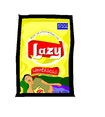
Gary B.: Lazy Potato Chips


Check back for my next blog entry where I will cover the creation of the Blasted Flakes parody including variations of the design and a very cool color progression will be shared here for the very first time...

Sunday, December 13, 2009

BAD

BAD Parody

The “BAD” parody title prominently featured in the Silly Supermarket Trading Card National Release pokes fun at the renowned “Prince of Satire”. The original painting for this design measures 4 ¼” x 6 ¼ “. This artwork was done by “The Great” Jay Lynch, the artist responsible for numerous classic Wacky Packages and Garbage Pail Kids parody concepts. While Mr. Lynch has done thousands of drawings in his illustrious career, full color painted designs are hard to come by. Painting was commissioned and completed during the late 1990’s for a private collector, Mike Gidwitz. The Artwork was purchased by Top Shelf Enterprises, Inc. (TSE) in 2005 and included in the All-New Silly Supermarket Sticker set. The artwork is exquisite and was painstakingly painted with tiny brushes and a “Jewelers Eye” to create the fine detail achieved in this piece.

On the sticker releases there are three variations of the sticker. On the first pre-release set, the BAD parody design is larger in size and the black border around the sticker is half as thick as the other two variations. In the second printing of pre-release sets, the image is shrunken to about 95% of the first variation. This was to accomodate a uniform border that was added to all the sticker concepts and includes a faux die-cut line as the pre-release sets were not die cut. The third variation featured in the 2008 National Release has actual die-cut around the image. There were approximately 300 of the first variation (thin border), 600 of the second variation (faux die-cut) and an unverified number of die-cut third variation. While the original concept was created by Jay Lynch, it was retouched (airbrushed) by one of the artists working on the Silly Supermarket project for Top Shelf Enterprises (TSE). The original artwork was published in the Brazilian Mad Magazine Edition #145 (shown below). There is wording that needs translation. If you are able to translate, feel free to post the translation in a comment reply to this posting. Three huge posters measuring 28" x 36" were also produced for the Philly Non-Sports show and signed by Jay Lynch. These are the only three posters that exist in the world and are still maintained in TSE's underground archive. Stay tuned for our next installment when we cover the Bisquack design from inception to finish...


Bad parody sticker variations from left to right: (Thin border, Faux die cut border, Die Cut border).


Brazilian Mad Edition #145:


Find all the great product parodies at "The Silly Supermarket". http://www.sillysupermarket.com/